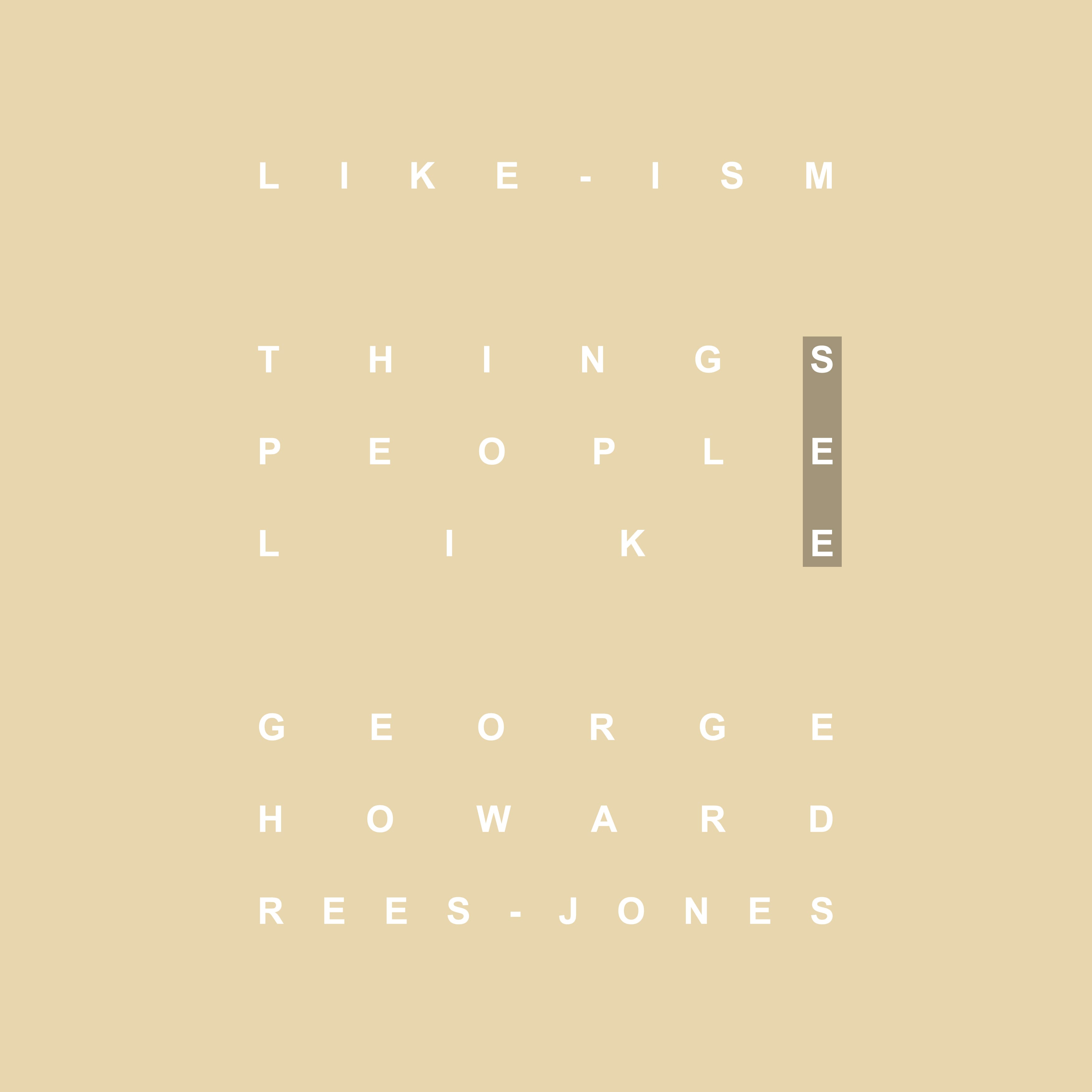
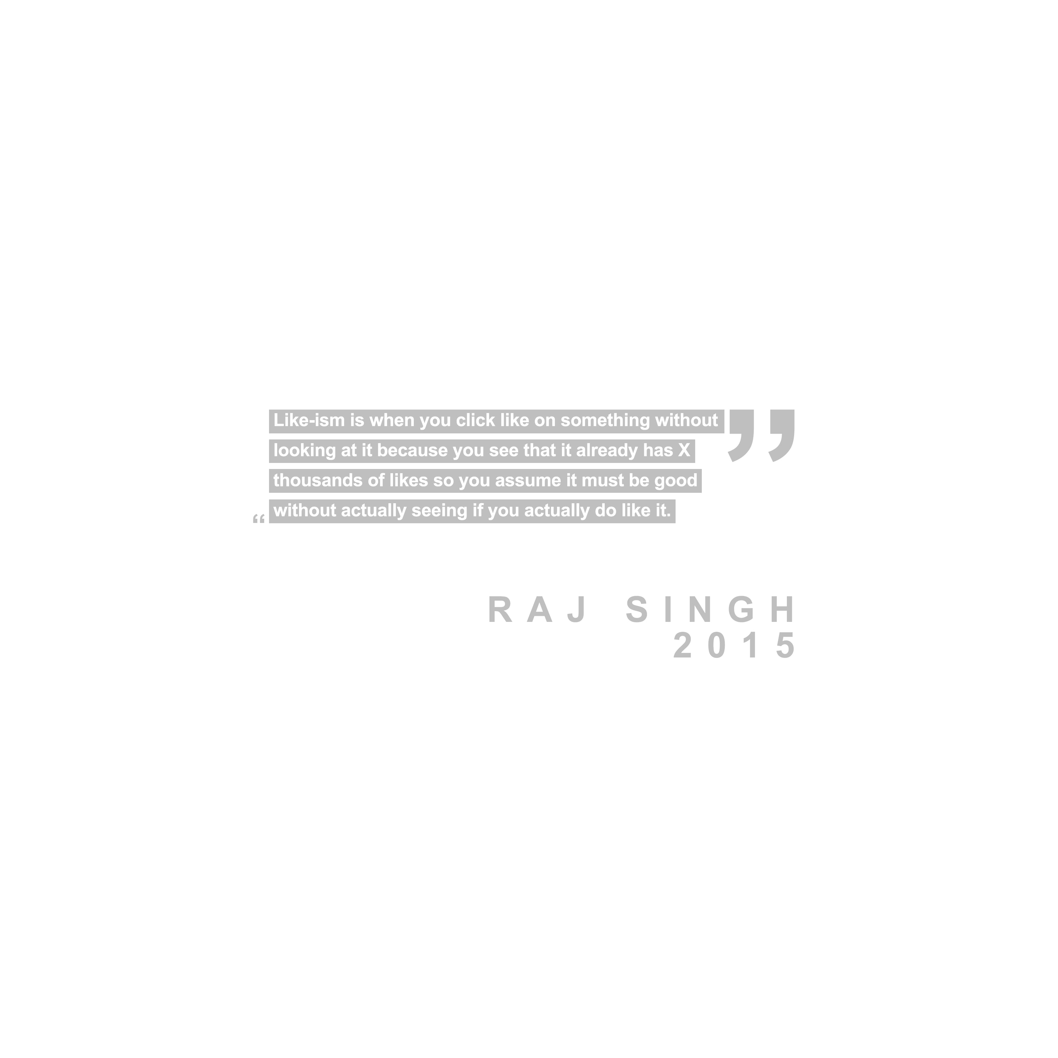
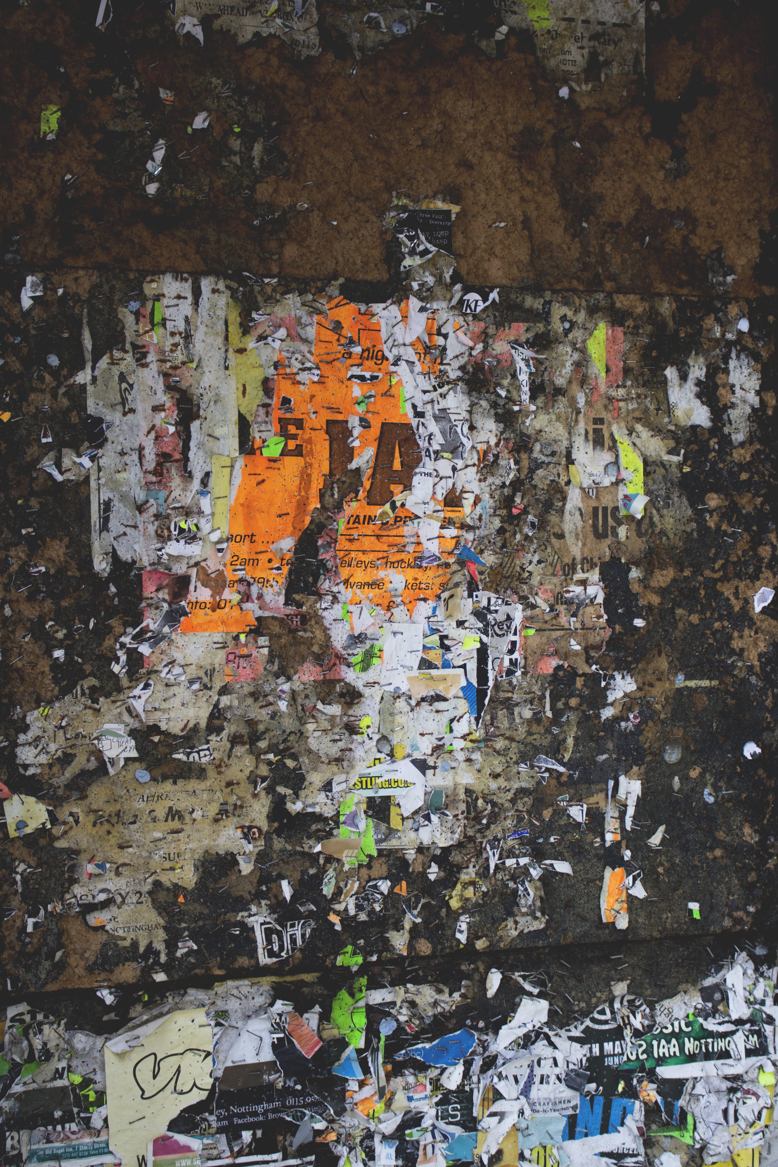
Photobook | Plagiarism

PHOWTOW

Plagiarism

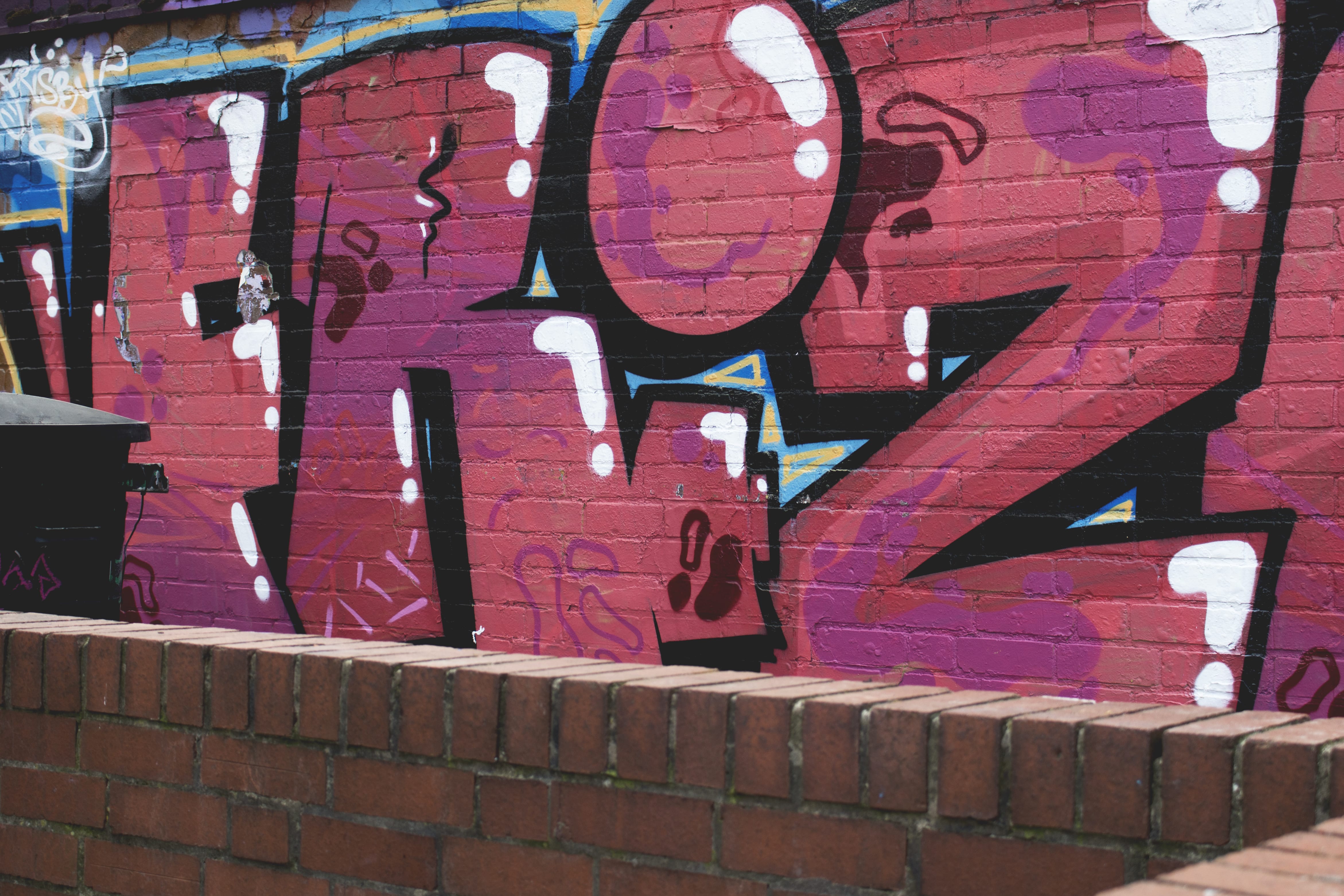
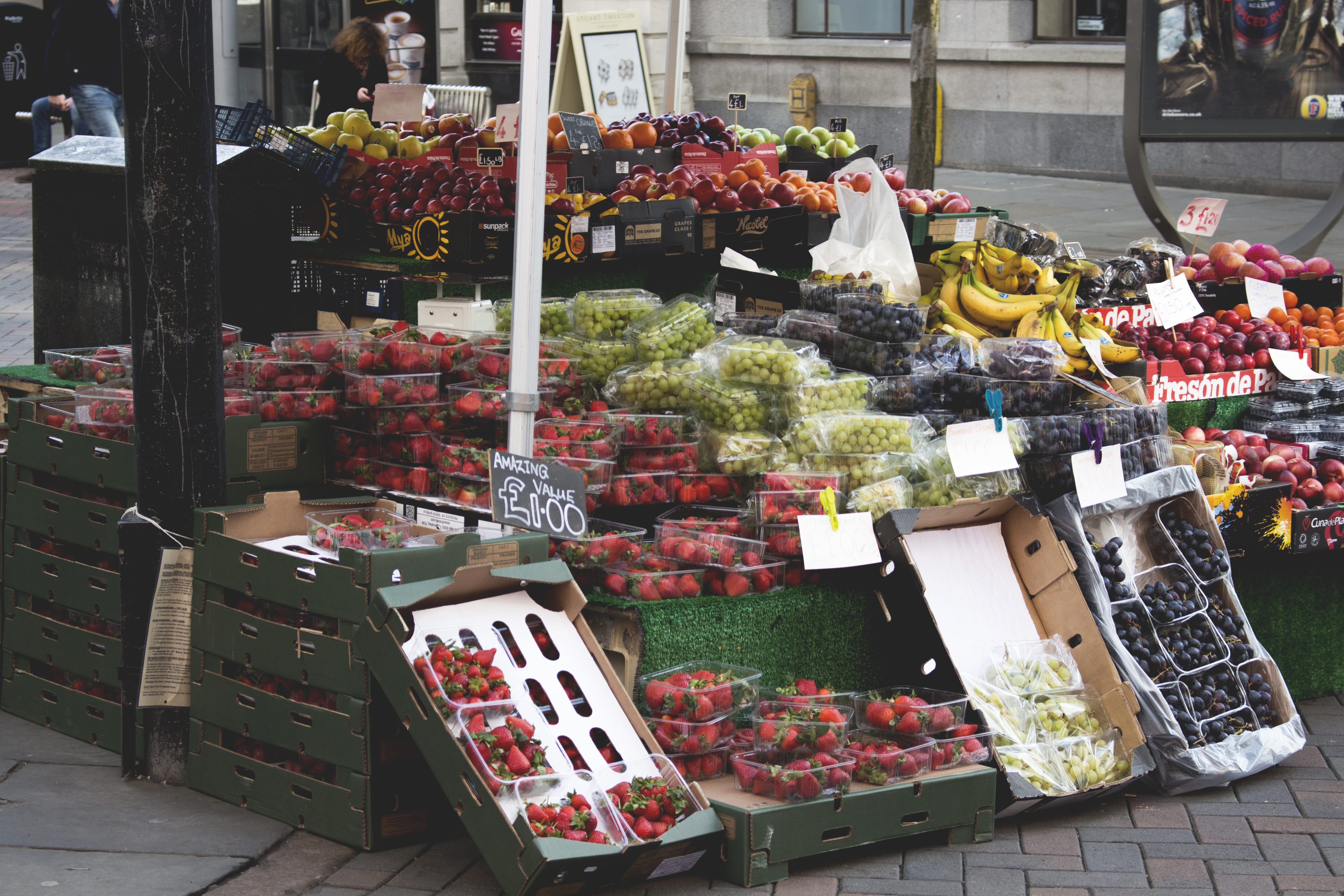
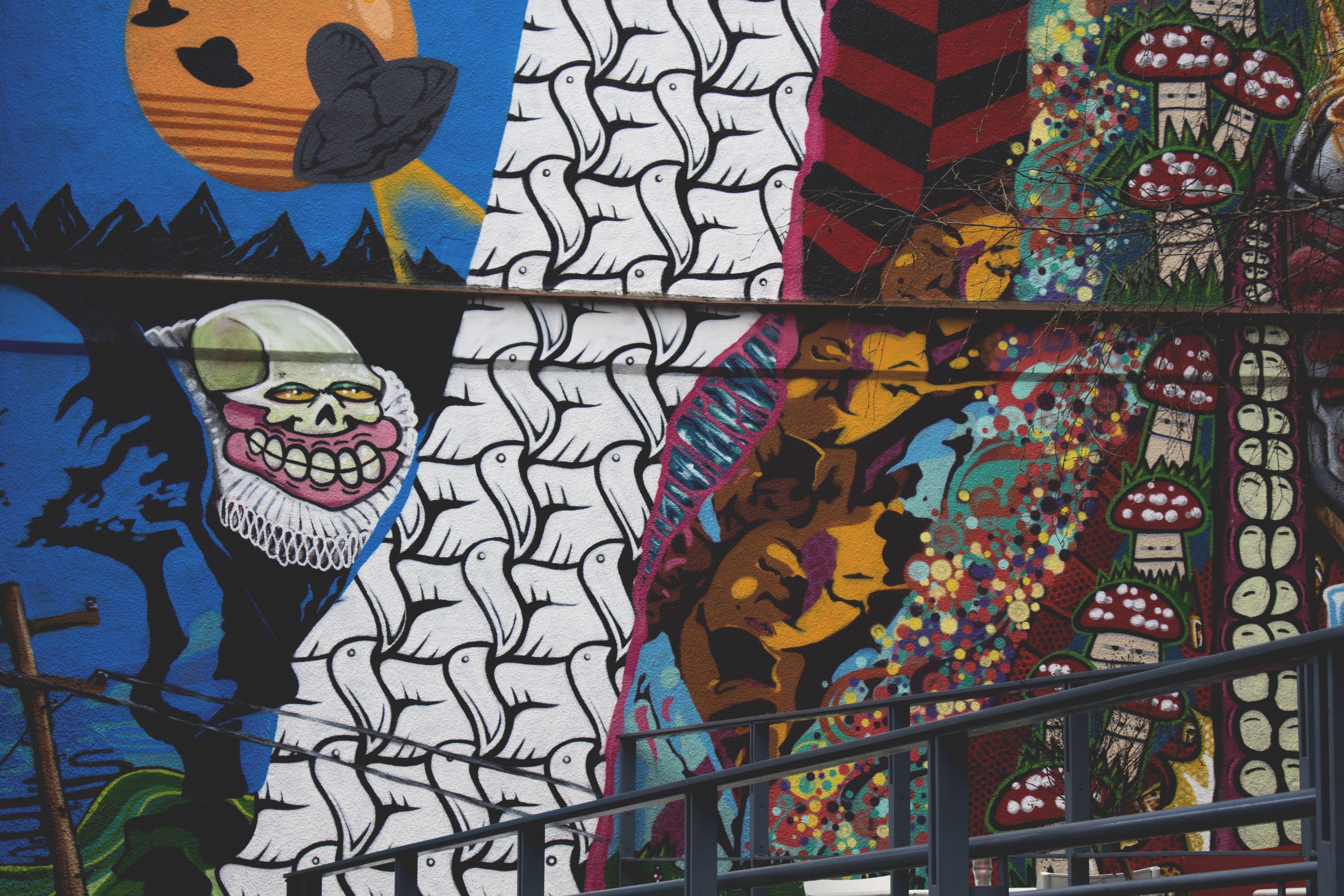
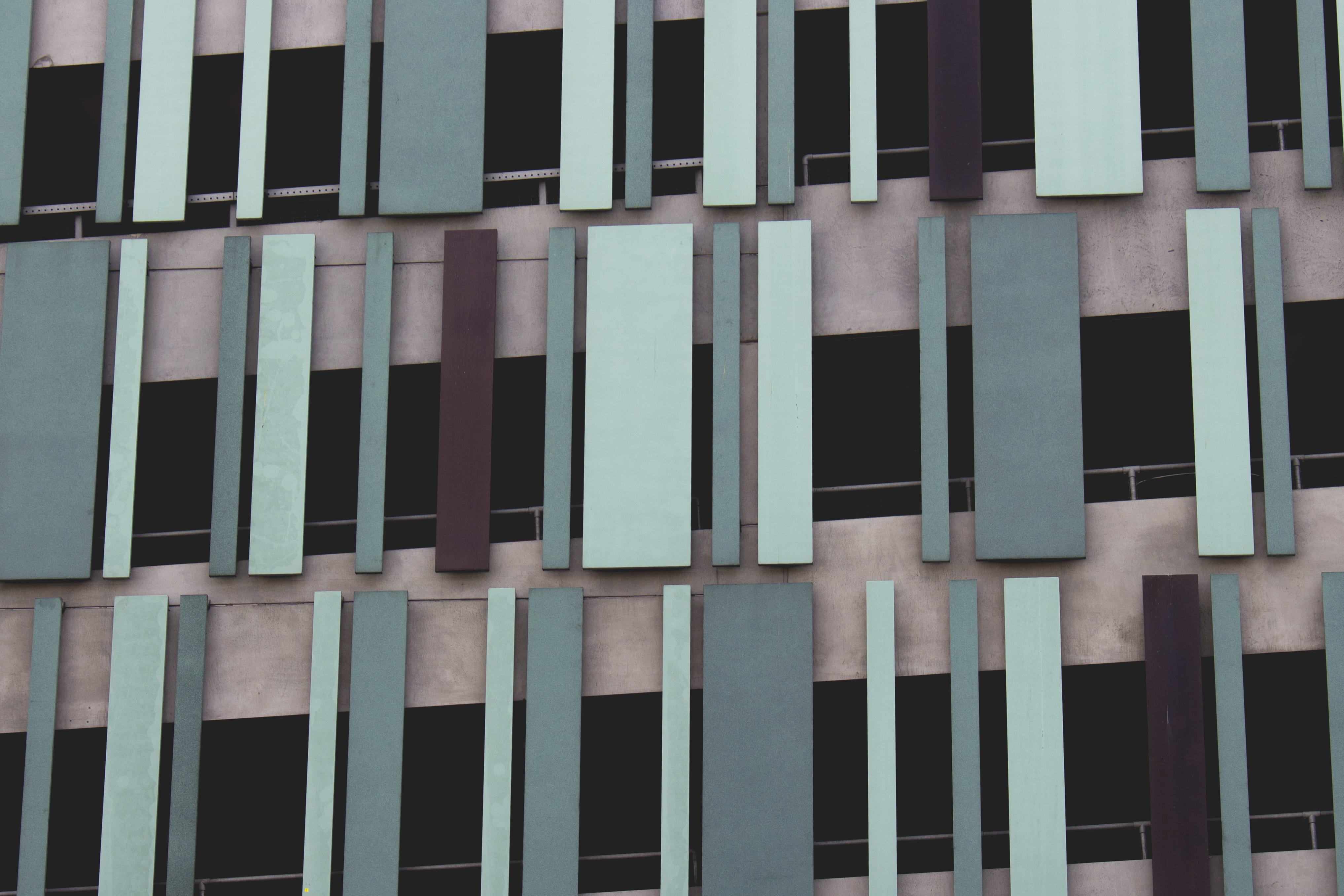
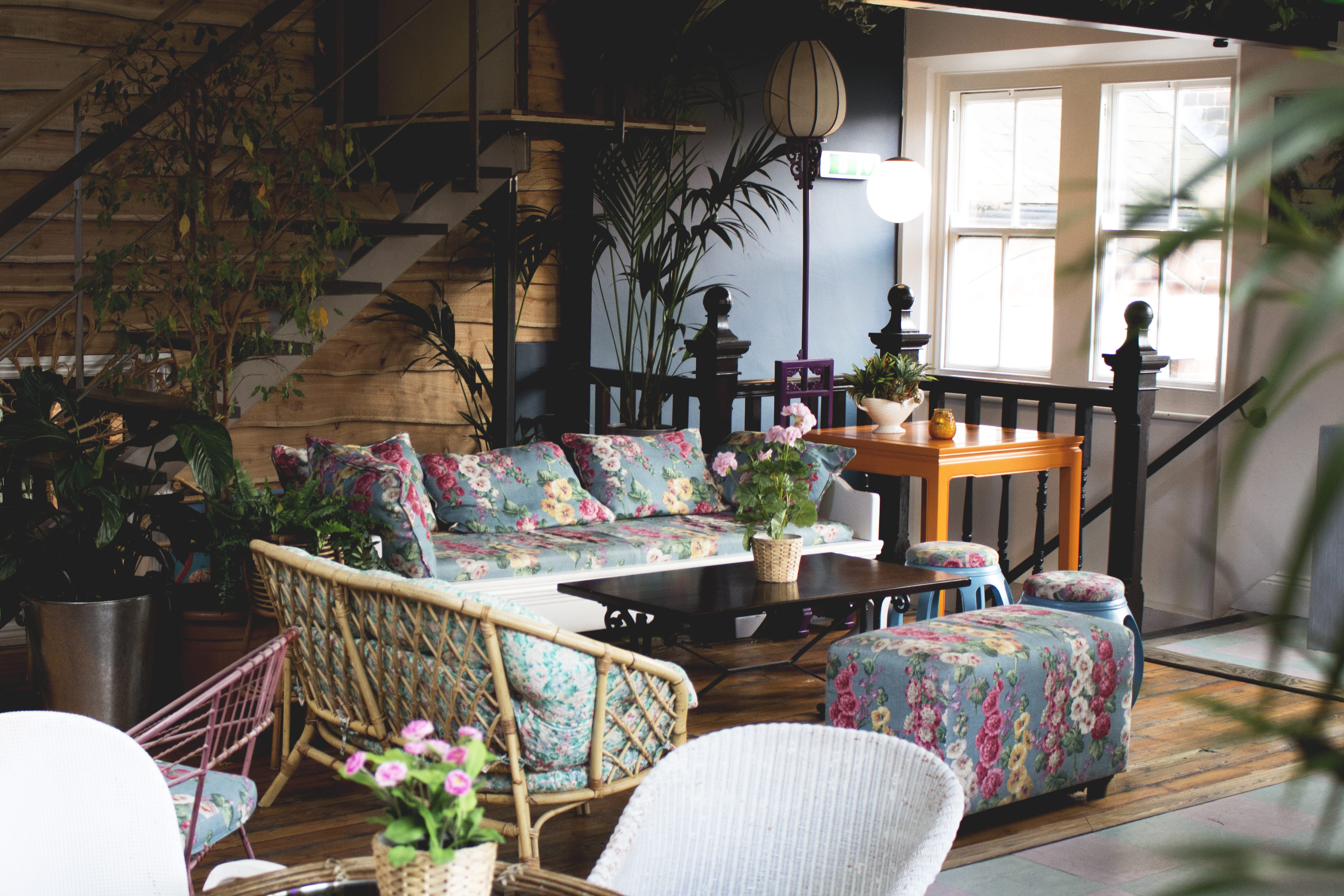
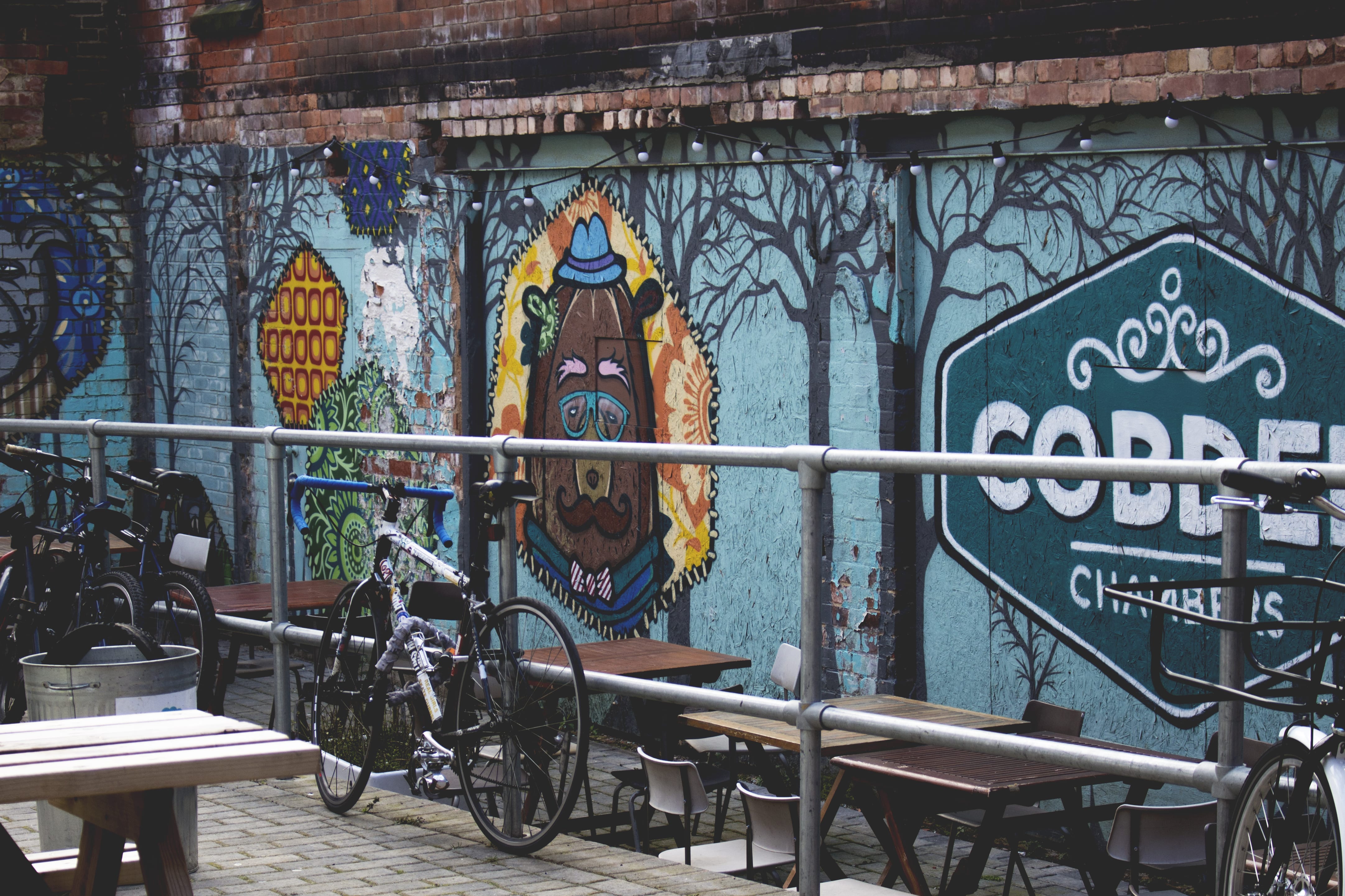
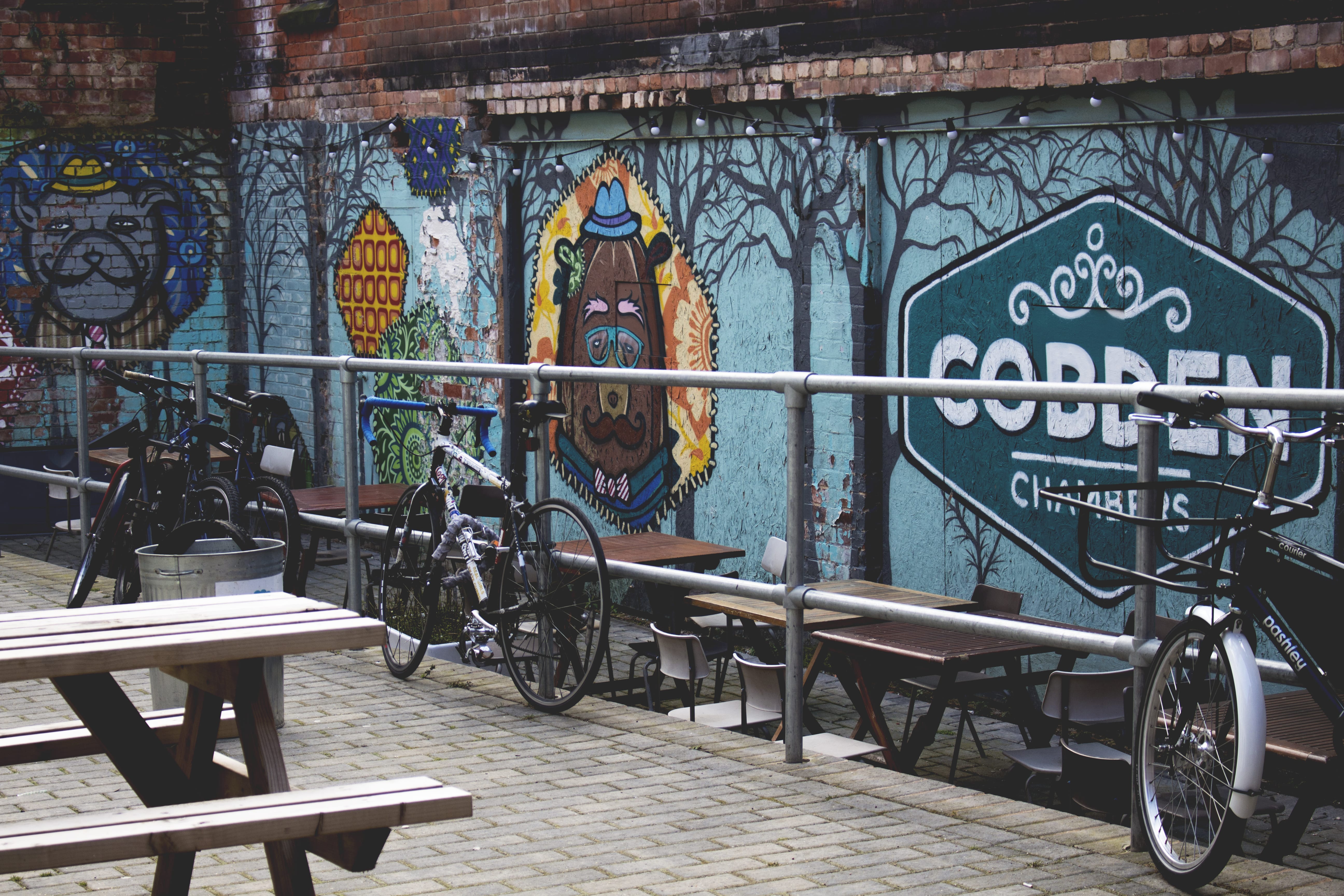
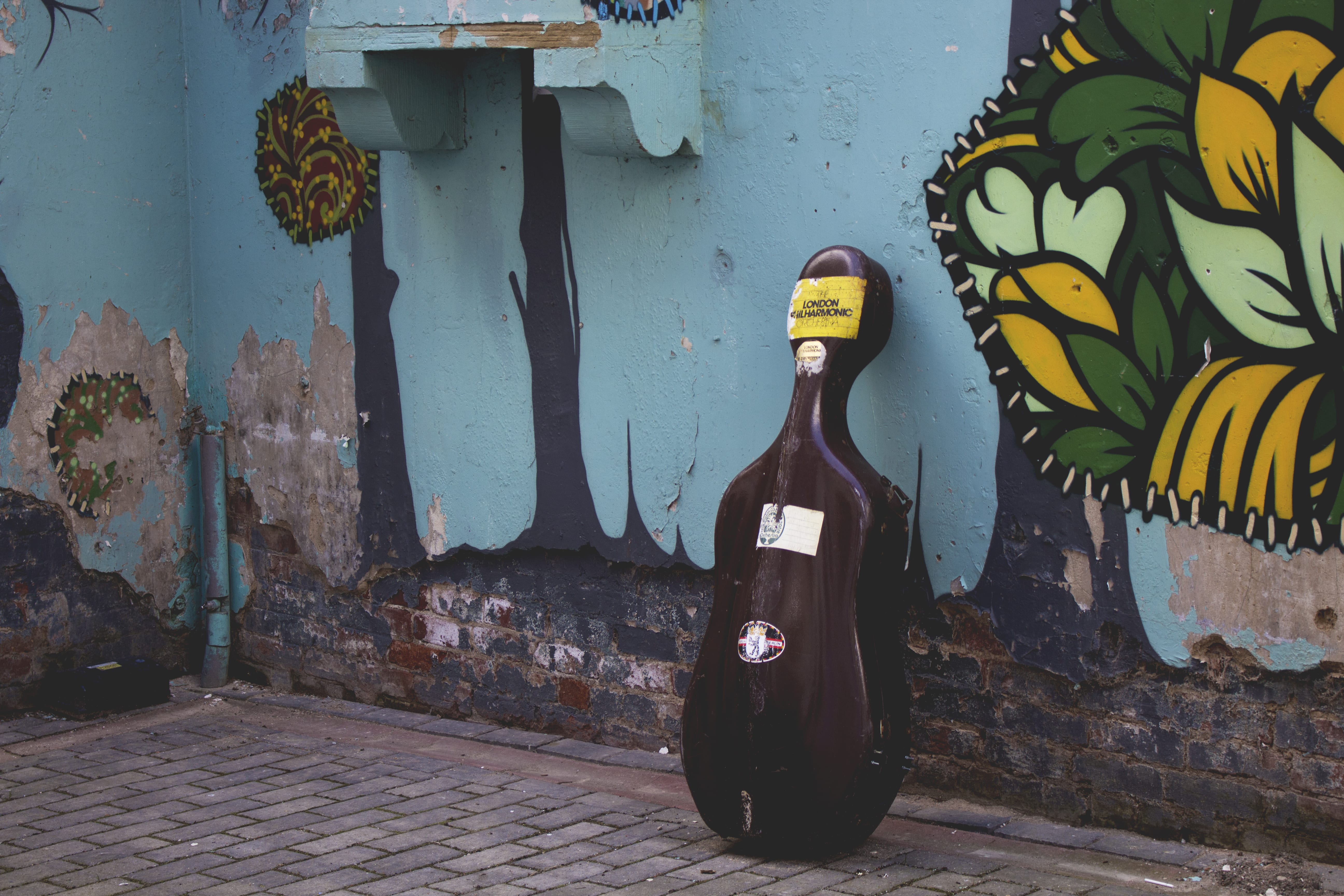
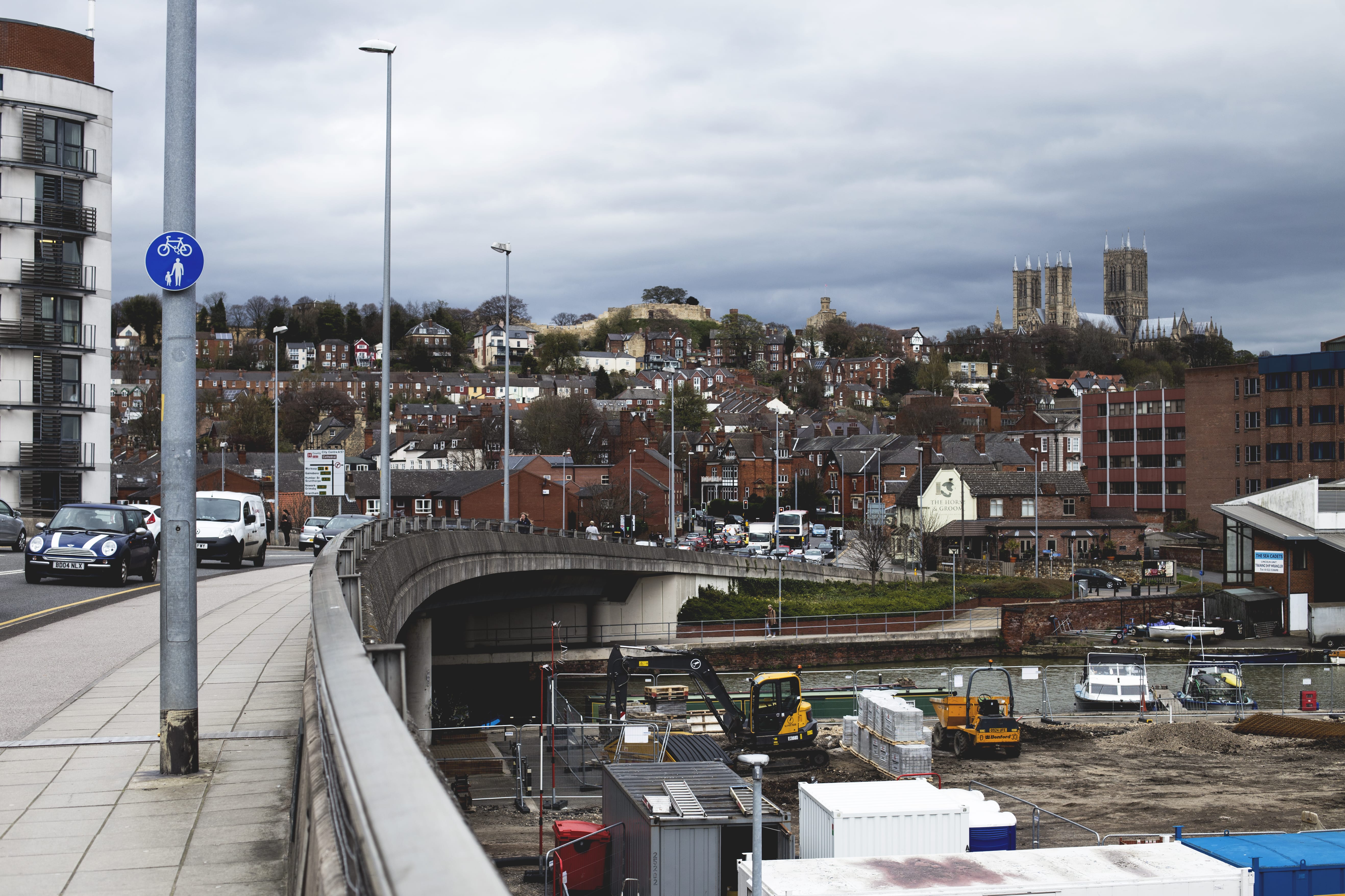
This image has various different contrasting elements; sky, buildings, lines, curves, and colour, with also an interesting change in textures. This will allow a varied array of images to be produced from this image.

The book will be split into 22 images, all created from this image, creating various different images with different meanings and settings. Each double page will be linked, with each image having a similar theme. This will be shown through; light posts, the bridge, architecture, construction. The start and end of the book will have images of the sky, showing an opening to the book, as a sort of establishing shot to introduce the book, but with little narrative to explain the book. This will be followed by a shot of the bridge, leading the reader into the book through the use of lines and angles. The images will then go through the image from the bridge in a clockwise motion, overall creating a journey around the main photo.

The overall image is never shown, as each image in the book will create a shot of someones view from their journey. This will then create a full image in the imagination of the reader, by piecing together each image to create a new full image of a city scape.

In the book, each image will be small, surrounded by a lot of white, giving room for the image, creating a dream like setting for each image within the book. I wanted to do this to allow the viewer to look back and forth easily, understanding the narrative of the book and creating there own image.

Overall I feel I have created a successful book, with an interesting concept. The images have contrasting themes which creates a more interesting book. If I could have created a larger image, to then create more images for a book of around 40 pages, this may have been a better book, due to a grander scale of imagery. But I feel the book has been developed well, using a suitable title which pieces  the book together well, explain how each image is a copy from another.

Photobook | Covers

Photobook p1

Photobook | Covers

I chose to design my covers like this to keep a minimal style to my book. The front shows the title Like-ism, with two subtitles: Things People Like, and, See. These show the elements of my book, and the thought proses of my images.

The back cover shows the quote of Raj Singh who defined Like-ism. I chose to highlight the quote to make it stand out, as well as putting varied quotation marks to create a more interesting image of text.

Each section of the book will have a similar page to the front cover, with the subtitle on, with each image having a different format for each section.

Photobook | Images

ToastpogJEEVS FAM RAYRAY GRAF BACK FRUIT MORE GRAF BUILD BIKE ROOM ESTAB GRAF EASTAB GRAF CELLO GOTH BURG 2 BURG


Photobook | Images

These images are my ideas of like-able images that are frequently shared on social media. The sections: Family, Culture, Food. These are the main styles of images I have found whilst looking through social media regally, finding the most appropriate trends to depict modern day-to-day life. Using my own opinions to create the overall styles and presentation of the images, I feel I have successfully created a series of images people can relate to and enjoy, therefor making like-able images for social media.

The family shots are of my own family at my brother and sisters blessing at a Sikh temple. This isn’t an everyday occasion, thus why I chose to photograph this event, creating interesting images for people to appreciate and enjoy. The shots start with an establishing of the family, with two detail shots to what they may be looking at, creating a narrative within the series of photos.

The culture shots show the side of Nottingham people may not know, but may interest them. I chose Nottingham as its my home city, and I want to show people the places I feel express culture in a positive light to the area. These shots also use an establishing shots, to then show more detailed shots of various areas within the area, and what may be behind the walls.

The Food shots represent a couples lunch in Nottingham (Mine and my girlfriends), showing a modern meal of Nottingham; burgers and chips. Also a pair of un-attractive looking breakfasts, made to look interesting through the various textures and lines within the images. This series of images shows the reality of modern life, that breakfast isn’t always taken with care, whilst lunch or dinner is something to be proud of and share with the world. The fruit cart is to close the book, whilst also keeping to the interest of food, but showing where it may come from, giving some small context.


Sound and Vision | Final

Final

I feel this is my finished video, and has been completed to how I wanted it to be. It would be better if each individual square had been animated on its own, but I feel I have overcome this issue by creating segments, which build up over time. The portrait overall is a successful image, as it has taken a lot of inspiration from Justin Roths images, but I have put my own take onto it, by adding smaller squares to create a less harsh grid, making the image more appealing to view. The image is black and white to reduce the human side of the image, to represent a more digital side, as well as making it easier to develop the portrait and its textures and shadows.

With editing the portrait into a video, I feel this was a very successful project, as most animations where on the beat as I would have hoped for, a long with some beats being left out to develop a more humanistic piece, allowing the music to play on its own for some beats, letting the audience appreciate the music, as well as adding suspense to the image being created on screen. The fades in the film help the portrait react more with the music, as the first time it happens is on a crash, letting the image fade out as a crash cymbal would.

I felt like putting the main titles at the end, as it shows the final image at the end, so hopefully the audience only understand the film when they have seen it all the way through. Also the use of orange in the titles is due to being my favourite colour, yet expanding the way in which this project is for the whole self, as previously stated in earlier posts.

The sound track I created on the music producing software Reason, which enables unrestricted creativity when coming to creating music. I chose to created a jazz styled beat, due to liking the genre, and also taking inspiration from the Birdman title sequence, with its broken jazz styled drums, animating the text to appear on the beat of the drums. I felt like I have created a similar effect with my film, by animating the segments on the beat, therefor creating a successful piece which is a clear representation of sound and vision combined.