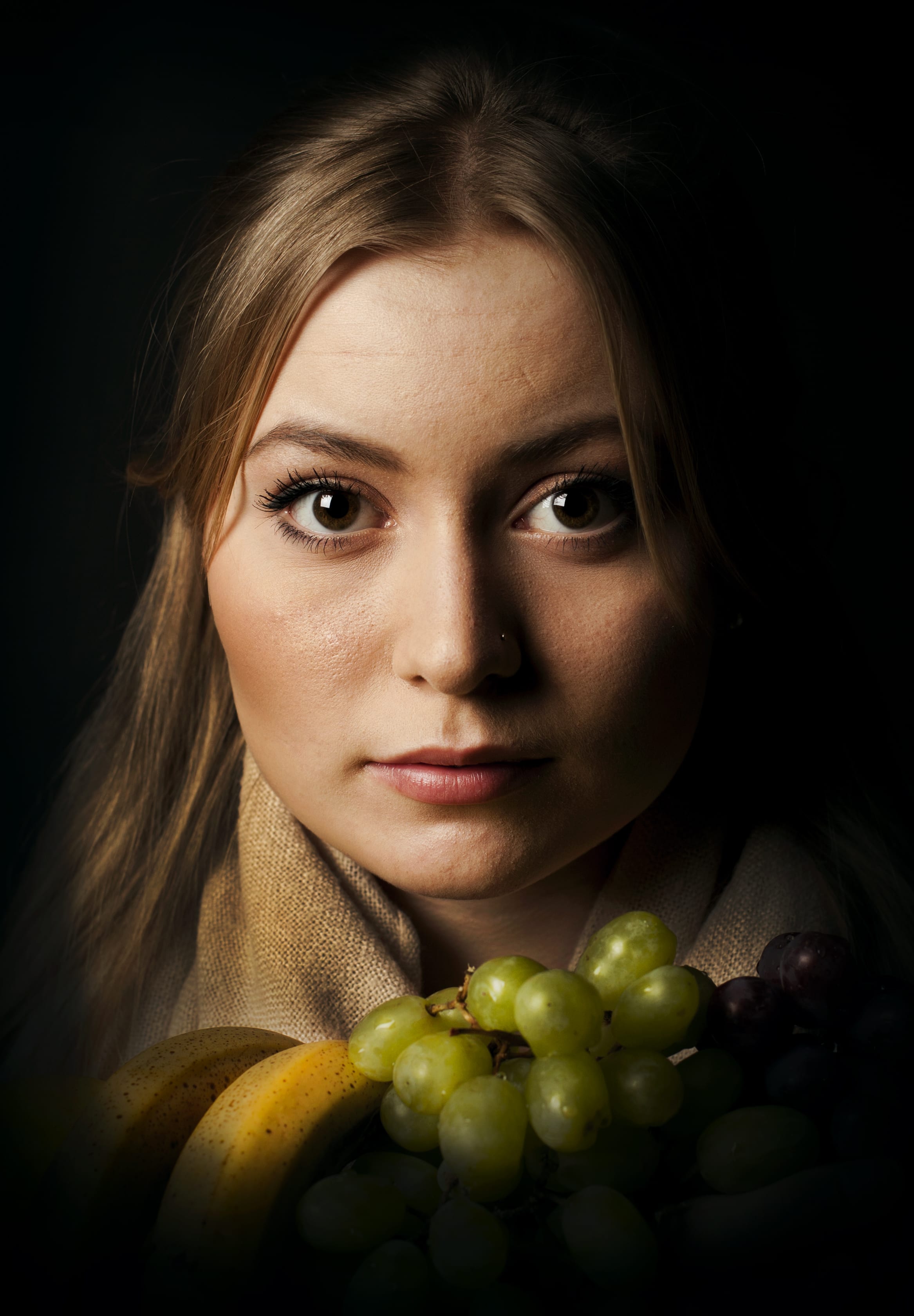
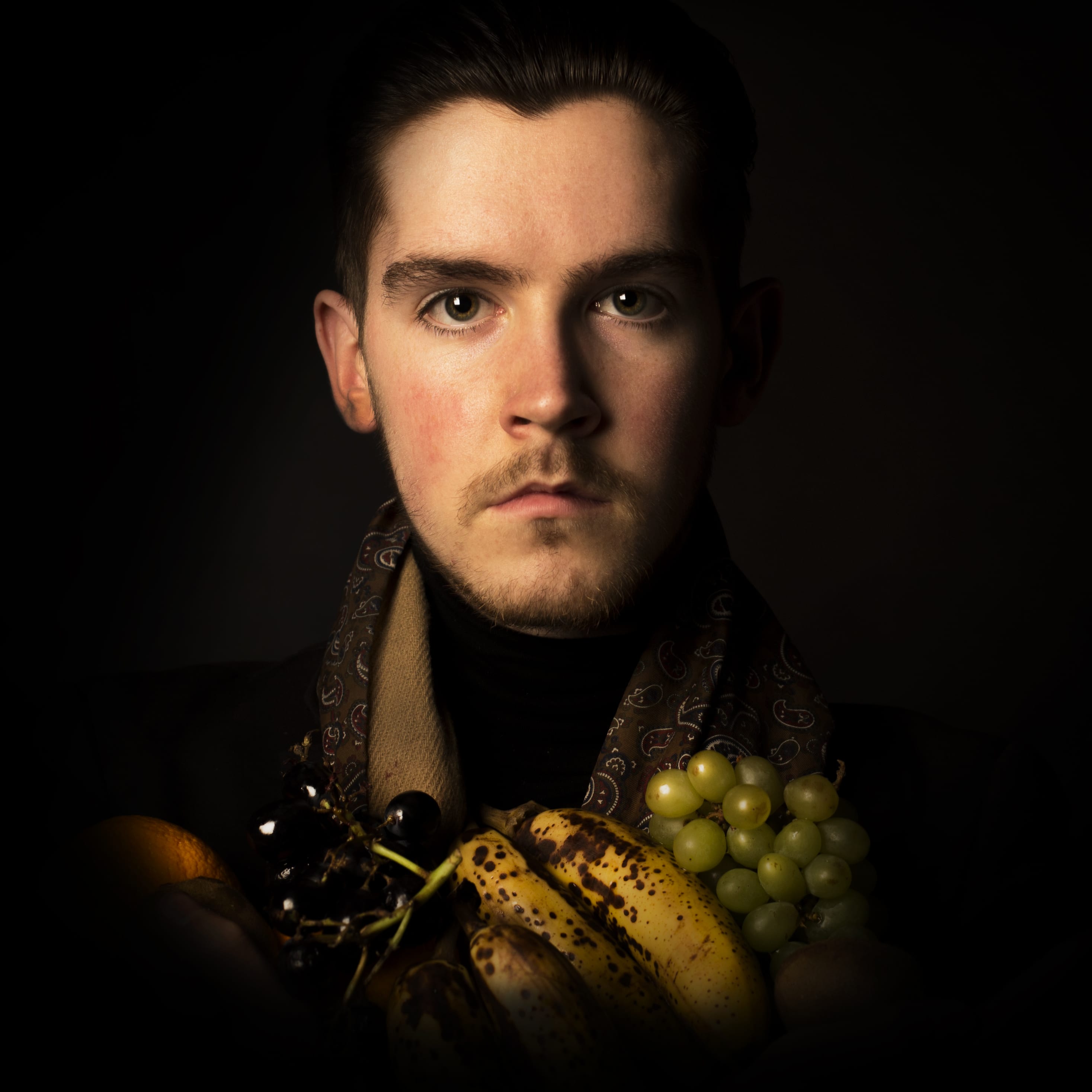
Exhibition | Portraits and Still Life
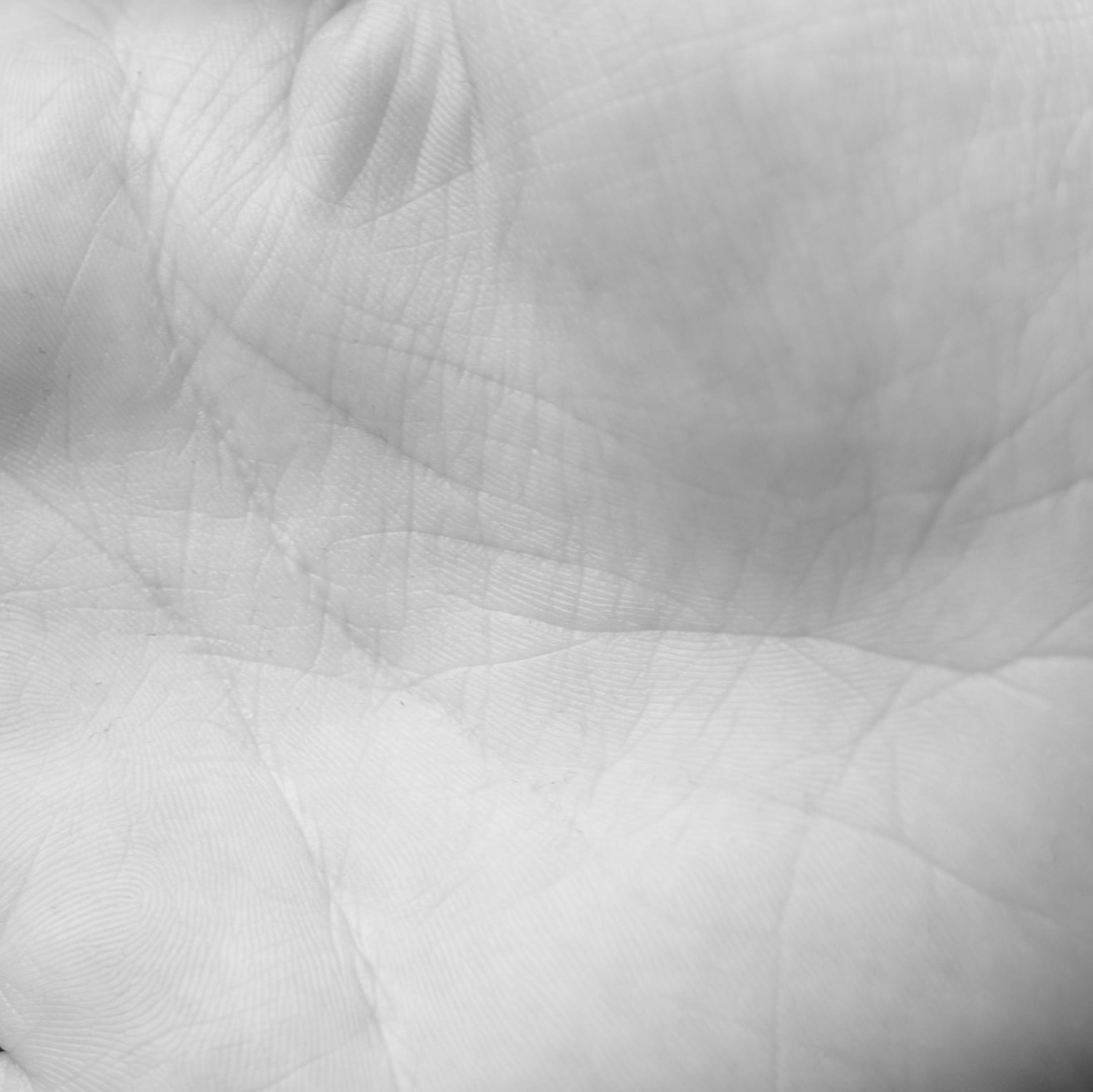
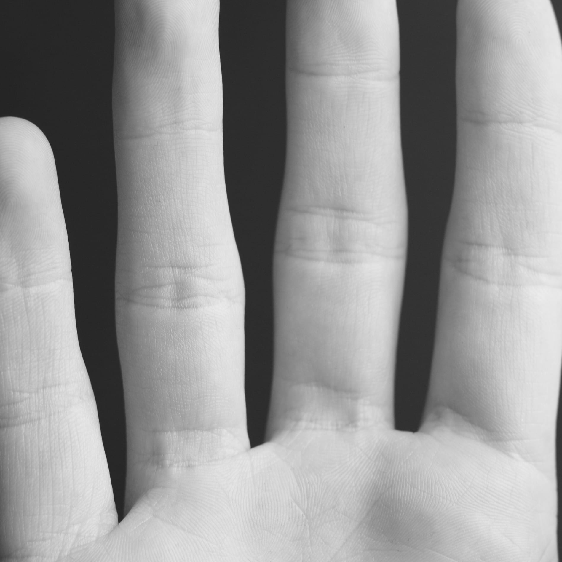
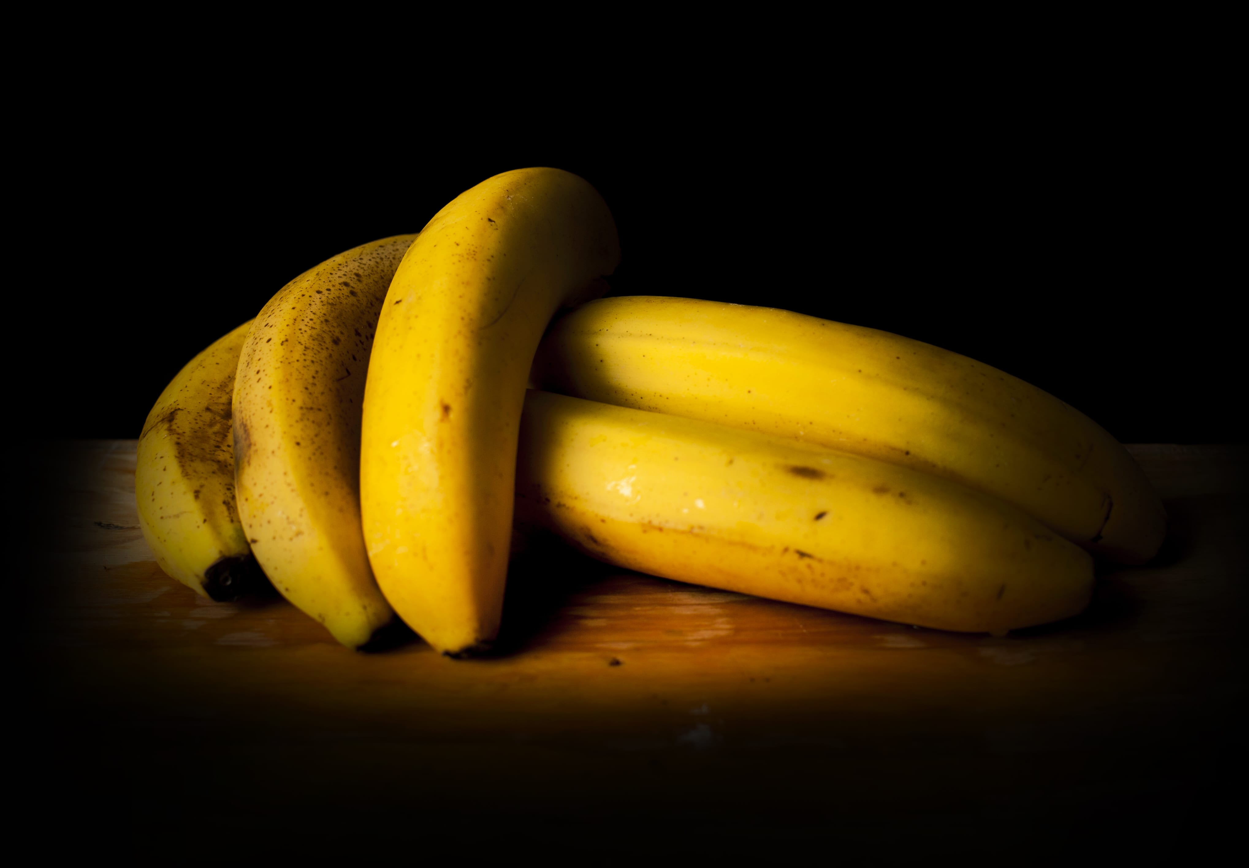
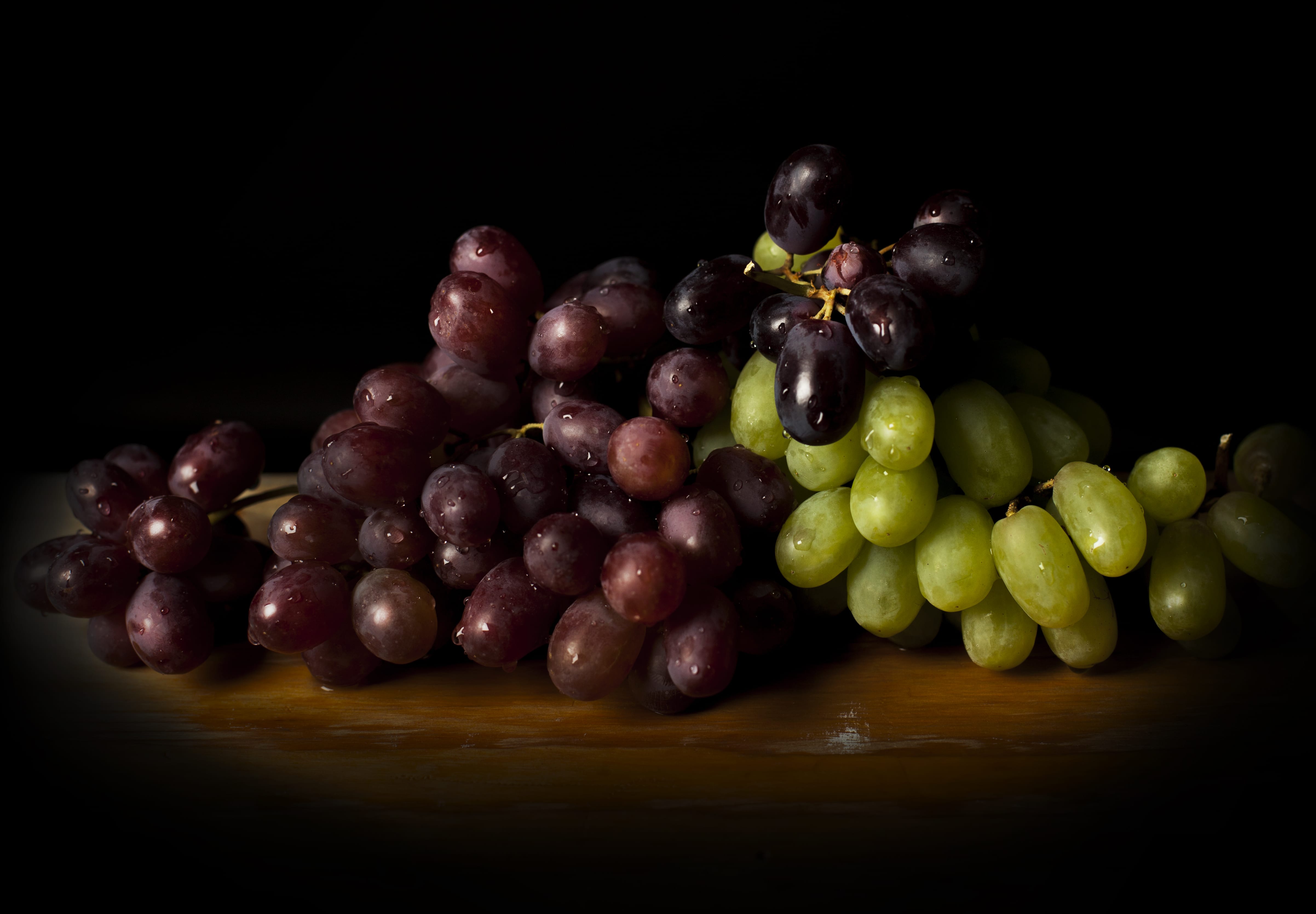
These photos are in a Rembrandt/Caravaggio style, using dramatic lighting to express the subjects faces, and to also bring out texture and highlights/shadows within the fruit. The black backgrounds help create a contrast within the images, adding drama to the image.
I chose to do 2 males, 1 female, and 2 still life. The 2 males act as protectors for the female, who will be entered to show her power and beauty, whilst the still life images of fruit help a add border to the sequence of images. This adds a narrative to the images, and when they will be displayed the order will show this layout of the images.
The images will either be displayed in and around bushes, to contrast with the golden frames, and to also link to the natural feeling to the images, with the fruit, and natural looking lighting. Also, as the images are in the Rembrandt style, I feel that nature represents that era well, due to the less developed time.
Another place my images may be displayed, would be in a local pub; an old style building that has been modernised. My images would be on a bookshelf, along side old books to help link in to the era.