Photobook | Images

ToastpogJEEVS FAM RAYRAY GRAF BACK FRUIT MORE GRAF BUILD BIKE ROOM ESTAB GRAF EASTAB GRAF CELLO GOTH BURG 2 BURG


Photobook | Images

These images are my ideas of like-able images that are frequently shared on social media. The sections: Family, Culture, Food. These are the main styles of images I have found whilst looking through social media regally, finding the most appropriate trends to depict modern day-to-day life. Using my own opinions to create the overall styles and presentation of the images, I feel I have successfully created a series of images people can relate to and enjoy, therefor making like-able images for social media.

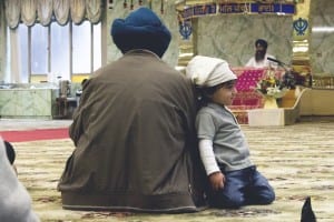
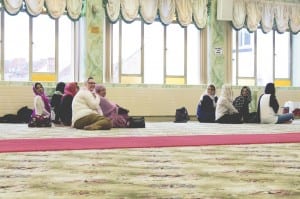
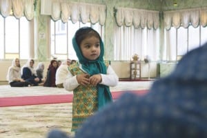
The family shots are of my own family at my brother and sisters blessing at a Sikh temple. This isn’t an everyday occasion, thus why I chose to photograph this event, creating interesting images for people to appreciate and enjoy. The shots start with an establishing of the family, with two detail shots to what they may be looking at, creating a narrative within the series of photos.

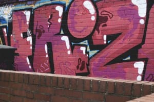
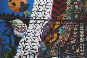
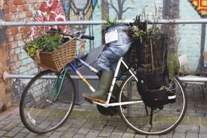
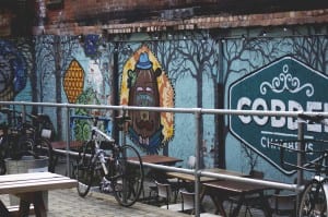
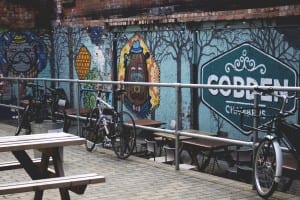
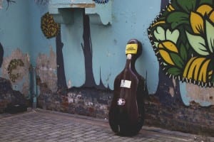
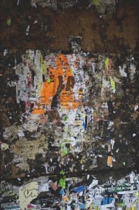
The culture shots show the side of Nottingham people may not know, but may interest them. I chose Nottingham as its my home city, and I want to show people the places I feel express culture in a positive light to the area. These shots also use an establishing shots, to then show more detailed shots of various areas within the area, and what may be behind the walls.

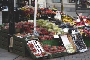
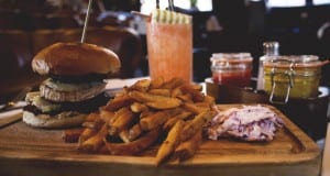
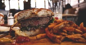
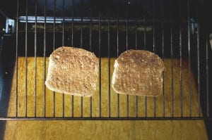
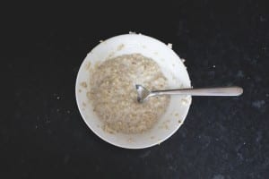
The Food shots represent a couples lunch in Nottingham (Mine and my girlfriends), showing a modern meal of Nottingham; burgers and chips. Also a pair of un-attractive looking breakfasts, made to look interesting through the various textures and lines within the images. This series of images shows the reality of modern life, that breakfast isn’t always taken with care, whilst lunch or dinner is something to be proud of and share with the world. The fruit cart is to close the book, whilst also keeping to the interest of food, but showing where it may come from, giving some small context.
 

Photobook | Research

BOOK RES

QUOTE: https://www.quora.com/What-does-like-ism-mean-in-the-sentence-Participants-invest-in-the-site-with-their-reputations-and-this-discourages-the-kind-of-trigger-finger-like-ism-that-leads-to-bad-curation-on-many-social-media-sites

SIZE?: http://blog.size.co.uk/2016/02/27/introducing-size-annual-2015/

ROBERT FRANK: https://www.youtube.com/watch?v=8-01NkUGBO8

CANDIDA HOFER: https://vimeo.com/39035039

DAVID SPERO: https://vimeo.com/39004319

ROBERT CLAYTON: https://vimeo.com/137367249

DAVID CARSON: http://www.davidcarsondesign.com/t/clients/bose-corporation/

Exhibition | Final

image image image image image image

Exhibition | Final

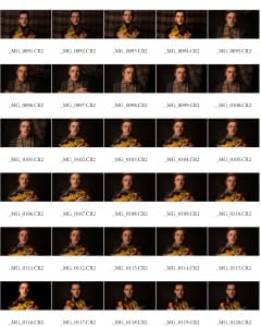
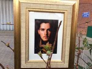
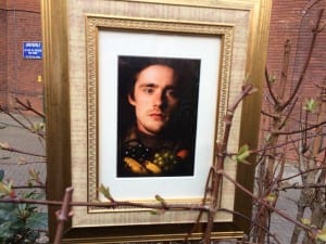
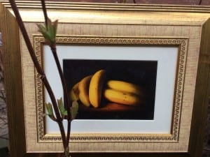
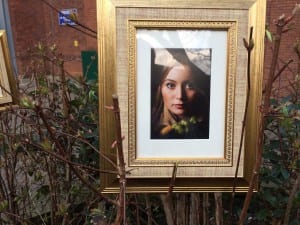
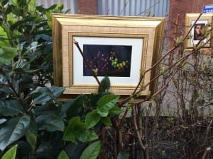
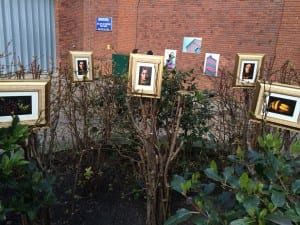
My final idea for this project, was to exhibit my work in a unique style, but also keeping to a classic style as well. The gold frames help boost the appearance of the images, whilst keeping to the Rembrandt style and style of display. The white borders in the frames then create a more modern feel to the display, as I wanted to mix modern with old, as shown in the images: modern smart attire, in an old style portrait, as well as including fruit in in photo, mixing still life with portraiture, which I feel has been carried out effectively. The greenery helps mix in with the images, as it gives contrast to the frames, as well as mixing nature with portraiture, which is what my images do with the fruit. Also I feel that in the time of Rembrandt, nature was a big thing, and most things where natural in that era.

My pictures are displayed just under eye level, as the bushes aren’t high enough to be at eye level. But this gives the classic gallery feel to the display which I wanted to try and create. Also they are set out in an “M” shape to give depth to the layout, whilst also showing off the importance and beauty of the female in the centre. I feel that I could have chose a better location for my images, like a prettier and greener area, to really bring out the golden frames, and to make the photos more prominent. I could have also created more images, and uses more bushes, to really fill the area, making the whole environment about my images, making them more visible for the public to see.

Overall, I feel my exhibition was unique, as I used small images in frames, which all linked in with each other, and tried to set them out in a natural format, showing off natural beauty in and around my images, which is what I wanted to display.